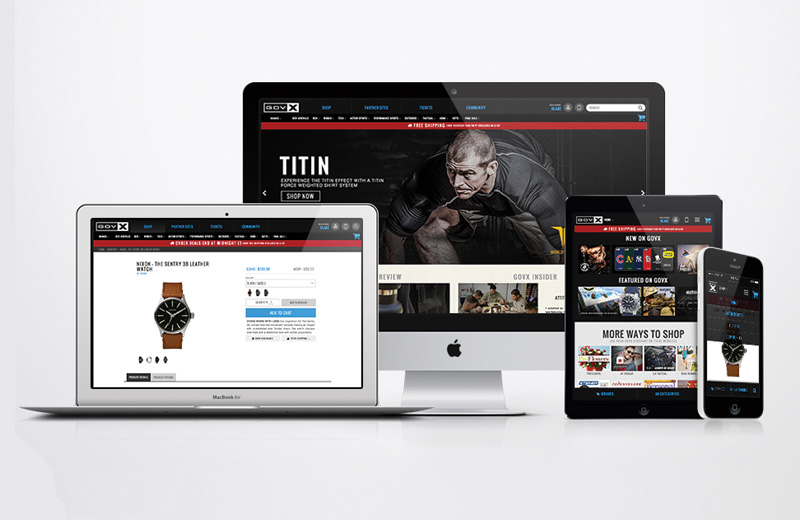
ATOMIC DESIGN / MODULARITY
for Govx.com, creating UI patterns with sustainable usage.Conversion of govx.com to a mobile first responsive site. Developing consistent UI elements as the brand found it's voice. Create modular and sustainable marketing elements that can be used across various sections of the site.
- Design
- UI
- UX
design Blake Weyland
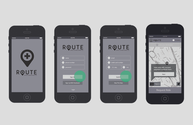
ROUTE IOS APPLICATION
brand elements, wireframes, & userflow for nonemergency medical transportation app.A project to develop a new idenity, wireframes, and user flows for a new medical transportation start up in san diego. Formely named 2pointB. The medical transportation industry for non EMS is a 6 billion dollar market cap. As Uber and Lyft have capitilized on the consumer ride share market, 2pointB looks to do this in the medical transport space. The work here is to map out high level user flow and initial wireframe concepts to review with the internal managment team at 2pointB.
- Brand
- User Flow
Brand Blake Weyland
UX Blake Weyland
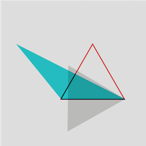
UI & CSS Animations
movement draws the eye.Duis aute irure dolor in reprehenderit in voluptate velit esse cillum dolore eu fugiat nulla pariatur. Excepteur sint occaecat cupidatat non proident, sunt in culpa qui officia deserunt mollit anim id est laborum.
Lorem ipsum dolor sit amet, consectetur adipisicing elit, sed do eiusmod tempor incididunt ut labore et dolore magna aliqua. Ut enim ad minim veniam, quis nostrud.
- Design
- Coding
- Animation
Designer Blake Weyland
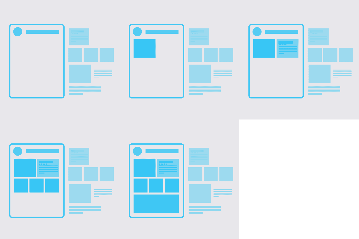
FLOWS, WIRES & TEMPLATES
Planning allows for more colaboration & feedback.user flows, wireframes, & CMS templating on projects for Web Shop Manager CMS & Govx.com. Contained are samples of flow diagrams for users and process. A typical wireframing example on a landing page project. Overall achievements from reconstructing an ecomerce cms templating system with a team of designer/developers.
- Architecture
- Coding
- Design
Lead Blake Weyland
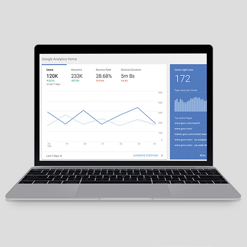
DATA ANALYTICs
extracting patterns, trends, and actionable information.Using quantitative and qualitative data to draw conclusions on UI/UX decisions. Projects: refactoring ecomerce taxonomy and global navigation system with user testing and itterative design cycles. Solve the problem of hw to portray growing numbers of sales brands and how to sucessfuly turn them into conversions. Determining where to focus our dev and QA resources by pairing google analytics and ecommerce data.
- Analytics
- UI
- UX
- Data
UX/UI Blake Weyland
Data Adam Riot
Product Chris Bohnert
Marketing Amber Martin / Aaron Pelander