Route (2pointb) is revolutionizing the healthcare logistics industry through a technology-first approach to patient transportation.
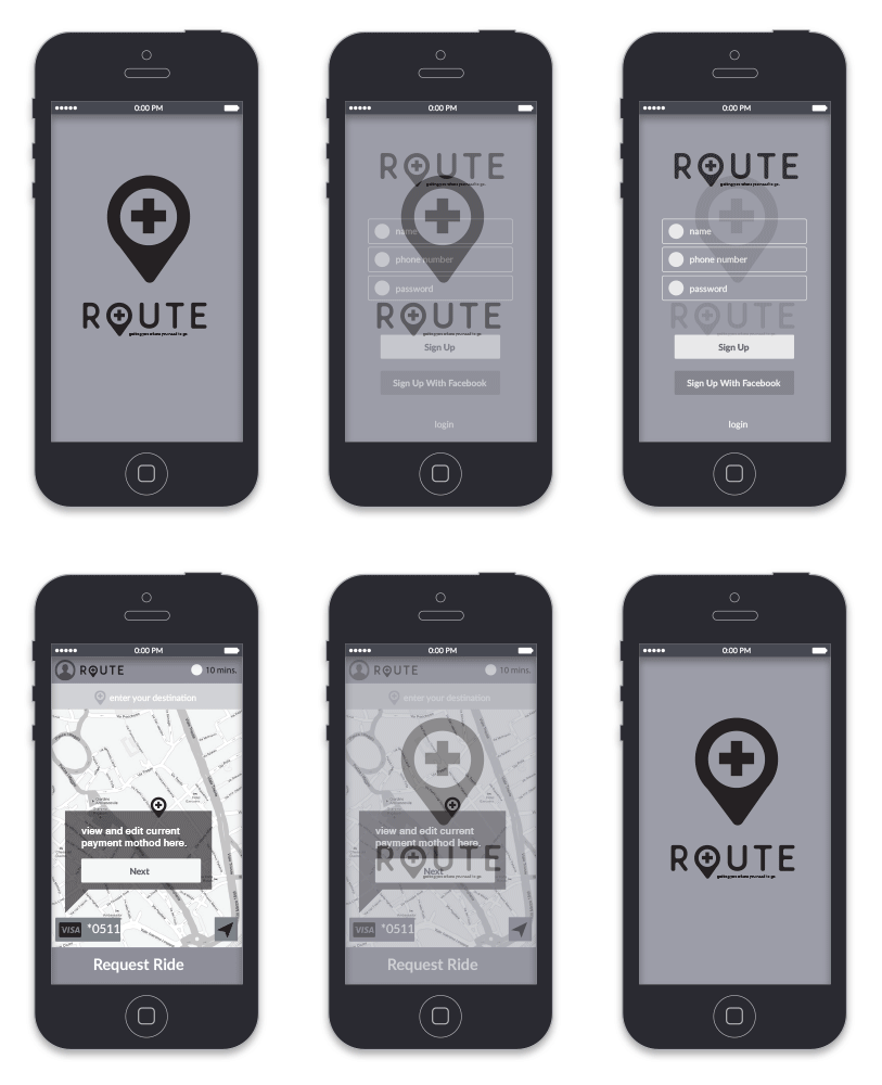
A project to develop a new idenity, wireframes, and user flows for a new medical transportation start up in san diego. Formely named 2pointB. The medical transportation industry for non EMS is a 6 billion dollar industry. As Uber and Lyft have capitilized on the consumer ride share market, 2pointB looks to do this in the medical transport space. The work here is to map out high level user flow and initial wireframe concepts to review with the internal managment team at 2pointB.
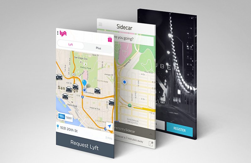
Research reviewing similar applications and breaking down the benifits for each.
Many ride share, and sharing economy apps exist and have itterated through many pitfalls. In doing usability analysis of each and developing feature lists, created a basis for common UI frameworks and steps to follow to make the transition to learning a new application less cumbersome to new users and more familiar while still itterating on the sucesses of each of these applications.
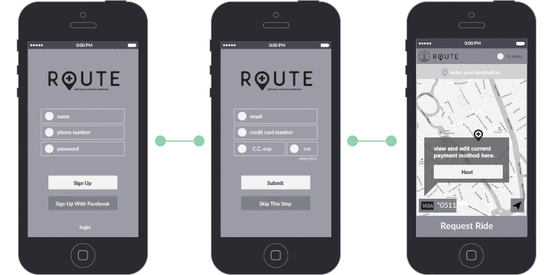
Wireframe flows
Sign Up
Request Ride
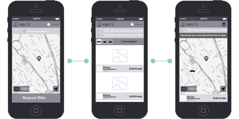
Flow Mapping
brand elements

