
Taxonomic
Restructuring
reorganizing the product taxonomy
& navigation to better suit users.
At the time of restructuring the govx product catalog was about 60,000 product skews. We were also onboarding an average of 20 new brands a month which ranged from 5 - 5,000 skus a piece. Comperable breath of product structure would be akin to any other large multi-category online general store, i.e. amazon, walmart, ebay, etc. The goal of the restructuring was to bring our taxonomy more inline with standard practices of other widly used online retailers. One of the Main Differences from Govx and the other large online retailers is the existance of an app where most mobile commerce transactions take place.
This Undertaking was a company wide effort. Working with the Product and Marketing teams, in conjunction with user testing using invision and user testing.com we narrowed the edgecases of the taxonomy. In looking at the mobile navigation systems of many site most inspiration came from backcountry and currys.co which both loose no category navigation depth on conversion to mobile. This enables users to navigate up to 4 categories deep down the tree.


Showing 100's of brands Challenge was show a large number of clickable brands in a sale.
As GovX grew and the number of brands we had in sales grew listing the logos or brand titles became cumbersome to the UX of visiting the home page and began cluttering emails. In an effort to counter this we created a hierarchical system of displaying the number of brands in a sale with a scroller that would hold up to 9 brand circles. The vier all button launched a modal with brands list and navigation to help people more effeciently shop brands in the sale.
To our suprise when this was implemented on sales across a year span. The button to trigger the full brands list modal was the 2nd most clicked item on the page after the hero image. Of the Users that clicked on the brands modal more than 2/3s clicked on a brand to navigate to a brand page. These clicks to brand pages made up 2% of all visitors to the home page. For example on Black friday where we had over 500k visits in a day, (500k x 2%), nearly 10,000 users travling to brand pages via this pathway. Which is over 3 times higher than any other feature on the page aside from the hero placement.

live eample w/ modal below:
view all brands
Black Friday sale brands
- # - C
- 2XU
- 4 Wedding Bands
- 5.11 Tactical
- 6 Pack Fitness
- Alps Mountaineering
- Alpz Cedar
- Alpz Outdoor
- Altama
- Amari
- American Blast Systems
- American Spartan
- Armpocket
- Bas Rutten
- Beaverfit
- BioLite
- Birthstone Jewelry
- Braven
- Carved solutions
- Casio
- CEP Compression
- Clinch Gear
- Cozy Orange
- Custom Gun Rails
- D - G
- Darn tough
- DC Comics
- Deuter
- Diamond Jewelry
- Diamondback Bicycles
- Eboost
- Edge Tactical Eyewear
- Electric
- Engagement Jewelry
- Ess Eyewear
- Fifth Sun
- FirstEdge
- Flagrant beard
- Garmin
- Gatorz
- Gemstone Jewelry
- Gerber
- GoPRo
- Grillbot
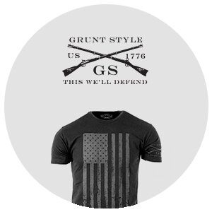
- Grunt Style
- Gunnar Optiks
- H - M
- Haix
- Hayabusa
- HIIT Bottle
- Hydro flask
- HYLETE
- HYPERICE
- Incipio
- Injinji
- Jlab audio
- Kiko Leather
- Lalo Tactical
- LifeProof
- Lightning X Products
- Liquid Courage Flasks
- Marmot
- Marvel
- Maui Jim
- Medicus
- Melon Helmets
- MIO
- Mobot
- Mophie
- Mota
- My Core Control
- N - R
- Naztech
- Nemo Equipment
- Nixon
- Oakley
- Ocean Enterprises
- Ogio
- Olukai
- Olloclip
- Orange Mud
- Original Swat
- Osaki Massage Chairs
- Otterbox
- Pearl Jewelry
- Picnic Time
- prAna
- Princeton Tec
- Pro Compression
- Pure Fix Cycles
- Ray-Ban
- Root Candles
- Ryno Power
- S - T
- Silent Pocket
Browser Support Analyize THe usage by each browser type and the cost of dropping support.

In the Wake of the transition to a mobile first responsive layout we lost some support for older browsers. In an attempt to determine where we should alocate resources for development and QA we compaired traffic and conversion cross referenced with device and browser version. For this we used propritary reposts from our ecommerce system NOP commerce and Google analitics. At the Time our conversion rate was 1.59%.
The AOV, Average Order Value, per customer was $100.81. we had averaged 573k monthly visits over the last year. The resulting factor was that every 1% of traffic was valued at $9,192. thus it was determined that if we could make and extra 20k-40k per month on a specific browser we would support it. this drew a relativly clear line in mobile and desktop support but i.e.8 was sitting in the middle.
we decided running an a/b test with a browser support upgrage modal vs the site as is would change conversion. This test was run for a quarter. Near the end of the test microsoft anounced it was dropping support for older versions of I.E. and with this so did we. you can fins the recomendations of browsers to support in the report link below.
View Report Summary
Data - Information - Insight
Data is the raw and unprocessed facts and can be quantitative (measured) or qualitative (observed). Information is prepared data that has been processed, aggregated, and organized to provide more context. Insights are discovered by analyzing information and drawing conclusions.
- forbes.com